Monday, 22 April 2013

How did you use new media technologies in the construction and research, planning and evaluation stages?

I have used many new media technologies when producing my media package, these vary from Microsoft word to PhotoShop. During these past two years I have learnt how to use many new technological programmes and have been able to take advantage of the recent advances in web 2.0.
My skills in PhotoShop have progressed radically during these two years, in my production i used many tools to ensure my magazine and poster were as realistic as possible, here are some examples of tools i used:
  • Filter
  • Brightness
  • Exposure
  • Contrast
  • DA font
  • Crop
  • Burn
  • Layers
  • Quick select
  • Rubber
All these tools helped me in producing an effective media package. See my previous blog posts for evidence of me playing around with these tools.
Web 2.0 has been extremely helpful in both research, planning and evaluation stages. For example Blogger has allowed me to publice all my information and reserach in a clear and sophisticated way. I have learnt how to embed codes easily and prduce high quality, clear work.
I have used Flickr as a photo forum to slide show my photos in a funky and different way, I created myself a new account and can now use it to produce photo albums to share on different media forums, Evidence of me using this is seen on my blog.
SlideShare has allowed me to present intricate presentations in a easy way, Signing up to an account last year, it has benefitted the way i have presented my work. Microsoft Powerpoint is needed to put a preasentation on SlideShare, as a universal product i found it easy to use and was another way of presenting my work.
 
I was introduced to a new way to evaluate my work - Prezi, Prezi is a web based presentation application and stroytelling tool that uses a canvas insead of slides. It was hard to understand at first but once i had taken the tutorial i had got to grips with the controls and began to create my own 'journey'. DA FONT is a website that i have used throughout these two year. It has been a great realiable website that has allowed me to experiment with suitable fonts that fit the genres i have been researching.
Youtube has been a fantastic resource i have used for research, it has enabled me to anlayse and understand trailer conventions. It helped me dramtically for the contruction of my trailer.  Twitter and Facebook, both extremely successful social networking sites have enabled me to arrange my actors and promote my media package. I have tweeted asking people to take a look at my trailer and comment for reviews that could improve my trailer.
 
The video equipment I used was as follwed: Panasonic HD, this enabled me to have a high quality video shots, it always had lots of settings, such as; white balnace, red eye and brightness - these all helped me capture a good video.
 
Overall I have benefitted a lot by using all these technologies, they have contributed greatly to my final outcome.
 

How effective is the combination of your main product and ancillary texts?

Sunday, 21 April 2013

What have you learned from your audience feedback?

Media Evaluation Questionnaire


Questionnaire

How effective is the title ‘TIED’?


Considering all 3 media products, who do you think is our target audience?


Did the trailer contain the right conventions to create fear?


How did the music effect the trailer?


What would you change about the trailer?


How did the trailer make you feel after you watched it?


Did any part of the trailer shock you?


Does the magazine cover look professional? If so why?


Would you buy this magazine if you saw it in stores?


Does the film poster encourage you to go and watch the film? If so how?


How would you rate the creativity of the package out of ten?


Could you find a link in all three products?


Is there anything I could change to make my products more effective?

In what ways does your media product use, develop or challenge forms and conventions of real media products?

Thursday, 18 April 2013

Final Trailer


Here is my final trailer, I am very pleased with the outcome.
It is currently on Facebook and been tweeted on Twitter to ensure it is being recieved by hundreds of people :)

Trailer Edits


This is an example of me playing around with the brightness levels, in both these shots i wanted a unclear view, I believe the brightness has really emphasised this clarity.

 
This is an example of me adding text to my film, here i simply took a photo from the film and edited it - I put a distorted look on the text so it trembles when it is shown.

 
This is an example of an transition edit, I have used various different transitions but the two I normally use, is the black fade and the white opening. I believe it works well for my trailer.
  Here I have added the 'New Line Cinema' Logo, this is also advertised on my poster. New Line Cinema is a real production company, this is why I added it to my trailer (with great difficulty) i had to convert the beginning of another trailer to an mp4 source and make it valid to be coped to windows movie maker!
 
Here is an example of part of my editing, I have included this green 'preview' box as nearly alll the trailers contain one these. I felt this would make my audience take my trailer more seriously

Final Poster


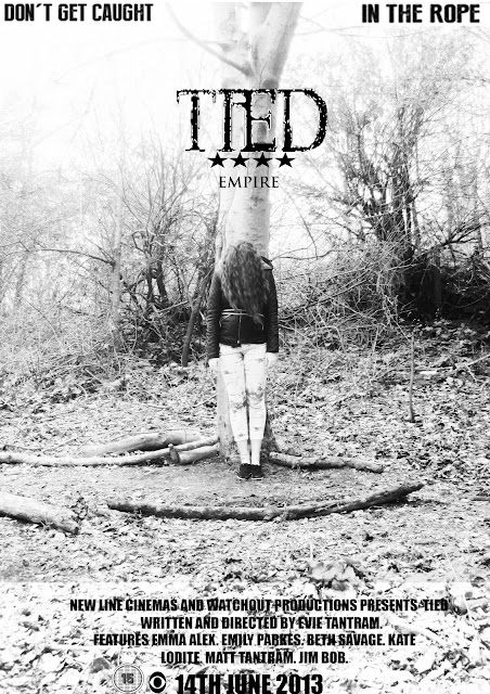
Here is my final teaser poster for my film ‘TIED’ I have used simple but effective conventions to portray my poster in a effective way. I used many tools when creating my poster, these tools included the brightness and contrast tool, this enabled me to give my poster a black and white theme which relates to my trailer. I have included my film productions name and logo and film rating. These conventions allow my poster to be accessible and understandable. The photo is the main focus of my poster, the graphic photograph is aimed to shock and alarm my audience but also intrigue them. Using the four star rating relates my poster with my magazine, and also reassures the audience that is has been reviewed as ‘worth watching’

Final Magazine Cover


This is my final magazine cover, over all I feel happy with the outcome of my magazine. I have emulated certain conventions, for example the masthead and this magazines specific style and format. This includes the date and issue of the magazine, where the barecode is placed and the amount of stories normally covered on one page. I have used many tools from photoshop whilst editing my magazine, these tools include, rubber, text, crop, copy, paint, blur and burn all used for different aspects of the magazine. I used da font for my tagline and main film title, I made the text distorted by using the gamma tool this created an eerie scary effect. i also removed the '15' rating sign because i found out magazine do not actually show them. I believe my main image is both eye catching and appropriate for the magazine, it not only grabs audiences attention, but it simple so it isn’t hard to look at. In relaity I would use a celebrity on my front cover, this would because It would increase my readership and attraction. This relates to Richard Dyers Star Theory which states: we relate to stars and idolise them, they normally have feature you admire or share.

Poster Progress


This is my final poster cover, i had to brighten the bottom part of the poster to ensure the text could be read. I had the date of the film in bold to make it more readable and included the 'WATCH OUT' production symbol to make the company well known.
Here I have added the title and the tag line, I used the same title font i used for my poster to ensure i had links within the different media texts. I liked the simplicity of the poster so so cautious to add much more.
After editing and choosing this image as my final poster image i used this as a basis of my poster. I believe the image on posters is the most important, It is the thing that draws the audience to the advertisement. I believe this image draws my audience into looking at the poster, this is due to the colours and the shocking photograph.

What Is A Teaser Poster?

A teaser poster is an early promotional film poster, containing a basic image or design without revealing too much information such as the plot, theme, and characters. The purpose is to incite awareness and generate hype for the film. A tagline may be included. There are some instances when teaser posters are issued long in advance before the film goes into production (teasers for cancelled projects are historically informative), although they are issued during the film development.

Magazine Progression

This is my final magazine cover, I edited the image in previous stages and added it last, I believe my final cover is effective and realistic. I have used all the suitable magazine conventions which has helped me produce my final product. All i had to do was size the image and blur the edges to match the background.
The final little touches I added to my magazine is the small eye logo to represent 'WATCHOUT PRODUCTIONS' which is also featured on my trailer and poster, this shows synergy between the media texts. I have also added the rating of the film to educate readers what the age limit is for the film advertised. Finally the star rating is showed to promote the film.
Here i dramatically added to my magazine - I used da font to create a font that fitted well with the style of my magazine and the colour. It was a distorted text which connotes uncertainty and brings a edgy look to the magazine. I have also included the tag line of my film which is also used on my poster and trailer - This is also in a distorted font. I have added 'magazine of the year' another general magazine convention. My sub-heading used relates to the focus of my magazine - a 'horror special' The sans- serif fonts I have used also reflect the horror genre.
I then decided to use a black background as it fitted better with my horror theme, white connotes naivety and black is more sinister and fits my horror theme. I also have added some standard magazine conventions which include the bar code and the date and price of the magazine

Here is the beginning process of my magazine, I firstly decided to use a plain white background to show simplicity and make my audience focus more on my image and text. I copied the title from another magazine and cropped into an A4 magazine page size.


Magazine Progress

After my initial research stages at the beginning of the year,  I had a vision of how I wanted my magazine to look

This was the magazine I chose to emulate and be the basis for mine, I made sure I would use similar conventions to make sure my magazine portrayed realism and professionalism.
This included emulating the mast head, sub text style, and main story/picture.

Wednesday, 17 April 2013

Edits - Poster

This is my final edit I did that I thought would work well on my poster. As I liked the black and white theme on the other photos for the magazine, I thought I would try it for my poster. I thought it worked really well and looked suitable for the ideology I held.

This picture was very close to being my main poster image. I liked how I used the brightness to create a juxtaposed image that contrasted my trailer content. I decided not to use it in the end as I wanted to use different colours to the ones used in my magazine  


On this edit I wanted to bring an essence of the forest colours to the picture, this is why I used the hue tool to increase the green tint. It made the picture have an unsettling look to, but I didn’t think it fitted with the image I had so did not choose it as my final picture.
This is the final photo I chose for my poster cover, I wanted it to reflect the isolation the girl faces in the film. I already had a outlook on how I wanted my poster to look and was very happy with this shot

Edits - Magazine


This is my final picture I chose to be the front cover of my magazine, I blurred and lightened the background and put some shadows and highlights to the hair, the contrast is dimmed and I slightly used the burn tool under the eyes.
With these last two shots I wanted to create some authenticity and make the picture more realistic. I dimmed the contrast and burned the eyes. On this picture I over did the eyes so did not choose it as my final piece.  

The brightness and contrast tool enabled me to make this picture have more of an edge and a fearful element. It made the black and white style more interesting and complex. I also used the burn tool here to emphasise the darkness under the eyes  

In this edit, I used the black and white tool and the burn tool to emphasise the black under the eyes. I liked this because black and white makes visions blurred and un clear. But I did not use this as my final because I felt it was quite dull and unappealing.


In this edit I used the contrast and hue setting to create an eerie shocking ‘in your face’ style, I didn’t choose this as my final picture because I felt it didn’t fit my films theme. It creates a sci-fi effect.

Here is the original photo I chose to be the main image on my magazine, I chose it because it is eye catching and a captivating shot. I started to edit the photos to chose how I wanted it to look.


Tuesday, 16 April 2013

Photo Shoot For Magazine and Poster

IMG_0164IMG_0163IMG_0162IMG_0159IMG_0158IMG_0157
IMG_0156IMG_0153IMG_0149IMG_0148IMG_0147IMG_0146
IMG_0145IMG_0143IMG_0142

Here I took my friend to the woods where we spent some time playing around with different shots that would be suitable for a magazine and film poster

Tuesday, 9 April 2013

Filming Process

Planning my trailer was a hard and frustrating task, I created a Facebook group where I added friends who were interested in being  a part of it. This enabled me to keep them up to date with dates of filming, costumes, times and props.   
I faced many problems when finding a suitable date, my main problem was the weather – as I was filming in dark surroundings, I had to ensure it was not an over cast day, it snowed many times restricting me to film. I realised I then had to be more blunt and straight to the point no matter what the weather was to ensure the filming would take place. I started filming on the 10th February in half term, some filming got done but it was completely finished filmed on the 15th March.  I have been editing the film to this point.

Music

Choosing the music for my horror trailer


Music in horror films is more powerful than in most other films. I think this is due to the dramatic nature and shifting pace of horror films and the very fact that the main purpose of any horror film is to scare us, and to do this by all means possible, not just by using its visuals. Even though the music is a very important aspect of horror films, it must never distract the audience. Music draws you in and creates suspense. Some horror films are known for the music score used in it, for example “Jaws” is known for its famous tense music. Also “Friday the 13th” music scared thousands of people.
For my music score I wanted it to be a constant tense tune that kept the audience on its edge, I researched many youtube clips and finally found a track called “The Trail” which has a horrible high pitched climatic feel to it. It also fitted well with the pace of my trailer, it dipped lower in the right places and wasn’t to repetitive.   

Props

Props:
·         Axe
·         Rope
·         Nails
·         Fake Blood
·         Dog lead
·         Plastic bag
·         Gaffer tape
·         Black make up
To make my trailer effective I knew I had to use suitable props, also props that were dangerous and connoted fear. I bought a zombie make up kit to make up my actors and make them look dead – I needed to exaggerate the make –up so it was noticeable on camera

Movie Taglines

Movie Taglines


Paranormal activity – “I feel it, I feel it breathing on me”
MAMA – “Mama stop it! You promised.”
Insidious – “It's not the house that's haunted. It's your son”
Alien - “In space no one can hear you scream”
Dawn Of The Dead – “When there’s no more room in hell, the dead will walk the earth”
Noticeable trends:
Movie tag lines are meant to be ambiguous, this is because they are aimed to chill the audience and let the imagination flare. They don’t want to give much away about the film, but just enough so the audience has a clue about the plot of the film – a tagline has the power to define genre. Taglines can be quotes from film – Films are remembered by their taglines, this is why they are so important.
When creating my movie tagline, I wanted it to relate to the title and be reflect the tone of the trailer. Here are a few examples taglines I created;
“Nothing is worse… than being burnt by something you didn’t think hurt”
“He doesn’t miss anything”
“Chop - Chop - Chop - Chop - Caught”
“His fantasy is your unimaginable nightmare”
“Don’t get caught…In the rope”
This is the tagline I chose for my poster, trailer and magazine, I think people will think twice about it. It is ambiguous but also short and audiences will remember it. People being tied up and not having control of themselves is something I know scares a lot of individuals.

Manuscript

TIED
Script
FADE IN
TENSE MUSIC STARTS QUIETLY
ACTORS WALKING TOWARDS GATE HOLDING HANDS - BOY WALKING THE DOG
MED SHOT
EMILY -  I don’t want to walk the dogs
JOE – Lets take them to the woods!
OPENS GATE
REVERSE SHOT
EMILY (FRUSTRATED) – Fine, come on before we freeze to death
WALK OFF DOWN THE PATH
FADES OUT ZOOM OUT - MUSIC INCREASES
WALK INTO WOODS HOLDING HANDS AND THE DOG
POV SHOT
MAN STANDING WATCHING THEM
SNAP SHOT OF EMILY BEING CHASED – HIGH CONTRAST - POV SHOT
ZOOM OUT  
EMILY & JOE & MAX – Rosie! Come back! Rosie….
CHASE THE DOG AS IT RUNS OFF
EMILY RUNS THROUGH THE WOODS ALONE – SCARED
EMILY – JOE? MAX? JOE! MAX
“DON’T GET CAUGHT” – TEXT ON SCREEN
FLASH OF MAN STOOD WITH AXE COVERED IN BLOOD

FLASHES OF IMAGES BOY BEING KILLED X2
MUSIC INCREASING IN VOLUME
JOE IS LED DEAD BY THE RIVER – EMILY RUNS OVER AND GRABS HIM SHAKING AND HOLDING HIM - CRYING
EMILY – Joe, no! Joe – SCREAM
(SEES SHADOWY FIGURE ON THE BRIDGE, EMILYS RUNS AND IS BEING CHASED)
“IN THE ROPE” – TEXT ON SCREEN
FLASH OF ANOTHER CHASING SCENE – HIGH CONTRAST – POV SHOT
ZOOM OUT
GIRL TIED TO TREE
SCREAMS TO REVEAL THE TWIST
“TIED” – TEXT ON SCREEN
MUSIC ABRUPTLY STOPS

I printed off copies and gave all my actors the script,
They found it really helpful and allowed me to direct the shoot easier.

Story Board